How climate change affects the generations
The stark conclusions of the latest UN climate change report summarising the most recent scientific research drew attention to the effects of global warming already under way across the lifespan of three generations.
A key graphic shows how the average global temperature has risen across the generations born in 1950, 1980 and 2020.
Encapsulating the conclusions of the so-called AR6 synthesis report that global warming was “more likely than not” to reach a 1.5C rise above pre-industrial times in the near-term, and that climate change taking place now would continue across the lifespan of multiple generations, was a “monumental challenge”, said Alex Ruane, a Nasa climate scientist and one of the report authors.
The task involved taking the last six reports of the Intergovernmental Panel on Climate Change, which cited and assessed 100,000 scientific papers, and condensing them into seven headline data visualisations.
The lead visualisation uses “warming stripes” to show how the average global temperature has risen about 1.1C since 1900, juxtaposed with the lifespan of the three generations.
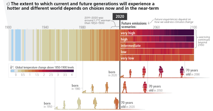
“First of all, the stripes are very recognisable and having this connection to generations was also going to resonate,” said Ed Hawkins, a professor of climate science at the University of Reading, who contributed to the work.
“It’s really hitting home that people born now, and in the recent past, are going to face a very difficult future if we don’t make different choices to ones we’re making today,” Hawkins said.
The resulting graphic that depicted the 1.1C rise in global temperatures already since pre-industrial times shows that a person born in 1950 entered the world when there was about 0.25C of warming compared with 1850 to 1900.
Today, a 70-year-old has experienced 0.85C of warming in their lifetime so far.
The rate of warming to date has been almost 50 per cent faster for those born in 1980 compared with those born in 1950.
“Something I’m really passionate about is putting humans into the data, helping us see ourselves within the information,” said the chart’s designer Arlene Birt, visual storyteller and founder of the infodesign consultancy Background Stories. “We need to put it into context.”
It was no small feat to complete the data visualisation. “Every word in the figure has to be approved by all 195 governments. Every choice you make will be scrutinised to the nth degree.,” Hawkins said. Birt estimated the graphic went through at least 30 iterations.
The team behind the graphic were keen to draw on the power of visuals in communicating climate change. “Scientists are well-trained in understanding how to read line graphs and interpret trends. This figure takes a clinical line plot and turns it into visceral stripes and generations that makes it more understandable and relatable to the broader public,” said Ruane.
Climate Capital
Where climate change meets business, markets and politics. Explore the FT’s coverage here.
Are you curious about the FT’s environmental sustainability commitments? Find out more about our science-based targets here